
There are plenty of reasons why one website will achieve high click through rates (CTRs) and another will fail in getting much traffic at all. If you have in place an air-tight search marketing campaign and engaging copy, then the next step is to do a thorough assessment of your website and its usability, to ensure that it makes the grade. So what is it exactly you should look for when it comes to website usability? Here are a couple of common misdemeanors that will turn off site visitors. Nip them in the bud and you will have a great chance of improving your conversion rate.
1. Bad copy
Poorly written English will annoy users. That’s all you need to know. Make sure that your copy satisfies the basics of grammar, punctuation, web conventions for scannability. After this, next level content should be on-point with your brand message and adequately convey the message to your target audience. A great idea is to hire a professional copywriter to do a content audit and make recommendations.
2. There’s too much going on
Back in the wild west of the internet 1.0 there was a lot of bad websites that heaved with flash animation, videos that opened automatically, poor colour choices and poor design. This is the number one no-no. Having a website that appears busy will obfuscate the intention and core message of the website and cause the site visitor to rapidly lose interest and click the back button.

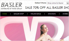
3. The site is retro-central
A dated website communicates that the site owner hasn’t made and effort to get with the times. It speaks volumes and all of the messages are pretty negative from a user’s perspective. The message conveyed is that the site’s owner is careless, apathetic or stuck in the early 00’s. Steer clear of 2004 drop shadows and flash animation. As a rule, update the design on your site to reflect technological and aesthetic developments every 2-3 years.
4. Too much movement
Movement on the site caused by automatically starting videos, pop-up ads, gifs and flash animation will repel users. It’s a dream for marketers and a nightmare for the casual website visitor. Make sure that you respect people giving you their attention, don’t abuse this attention.
5. Not responsive
A website should ideally look similar on a tablet, smartphone device or desktop PC. It should also look great on all browsers. Failure to account for these differences in the development phase will alienate users.
6. Silly Typography
Typography is important. Although if you go too wild with it, the results can be patchy, dull or unreadable. It’s important to get the right mix in terms of matching type that contrast well, in the right size and colour. The two most important factors are readablity and aesthetic appeal.
7. Ads appearing out of nowhere
It’s not very nice when ads suddenly appear on a site. This can change from minor irritation to a silent vow to ‘never again return to that stupid site’ – if you have ads that can’t be closed or obscured and have to run their course.
8. No social proof
It will instil greater trust from users if you include testimonials, customer reviews or ratings on your site. On e-commerce sites, high ratings for product reviews from genuine people will shift more product. Although as a caveat, don’t include fake testimonials that are written poorly by Joe Bloggs down the road. People are smart enough to spot fake testimonials a mile off.
9. No pictures or personalisation
This is a mistake as most people do want to put a face to the name. This makes the site more friendly and roots it in the real world. Similarly, if you don’t include an About Us page then you are missing an important opportunity to tell people what you are about.
10. No contact details
Include both a landline, a mobile, email and possibly a residential address for an office, or failing that a PO BOX. Hunting around for a business’s contact details gets boring pretty quickly for users. They will go elsewhere.
11. Hidden or confusing shipping information
Don’t muck around with shipping information and costs mid-way through the check out process. This is a sure-fire way to ensure that your abandonment rates are through the roof. Instead make it clear right from the beginning, the options for shipping, cost and estimated time-frames.
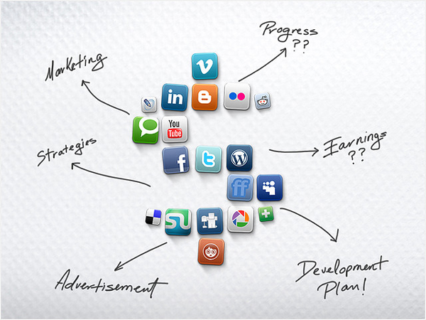
12. Too many sharing buttons
Putting twenty sharing buttons underneath a post may seem like it provides more opportunity for shares. In reality the opposite is true. It reeks of desperation. Keep it to five at a maximum.
There are countless other bad ju-ju ways to mess up your online presence. Although we don’t want to scare the bejeezus out of you. Instead for loads more helpful advice and affordable marketing and web design support, speak with Leon Fernandes and his team today.