Best Font Size For Web Pages
As you cruise around the Internet exploring webpages you may note that web font sizes are not standardised. There is a certain trend among web designers believing that smaller sized fonts give the web page a sophisticated look. It also means more content can fit “above the fold”. Setting aside any considerations for the aging eyes of the general audience, there is a strong argument for larger font sizes on web pages.
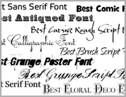
There is not a de facto standard for the type of font or size of font one can choose for their web pages. However, there are two categories of fonts: simple and fancy. A simple font is the Arial font. A fancy font is Brush. There was a study was done to evaluate how people perceived the complexity of completing a form based upon the type of font. This research delved into the psychology of simple fonts and it revealed that people were less likely to commit to an action if they felt that it was going to take a long time to complete.
Two groups of people were given the same instructions to perform a simple exercise. On set of instructions was typed in simple Arial font and the other in fancy Brush font. The people who read the simple font instructions said the exercise would take 8.2 minutes. The group who read the exact same exercise typed in fancy font thought it would take 15.1 minutes to complete—nearly twice as long.
Our brain translates hard to read text into hard to read actions. What does this mean to your website design? Stick to simple fonts and make the type size easy to read. Keep words simple. Make sentences short.
As for font size…What the W3C Says
The World Wide Web Consortium (W3C) is an international community that develops standards for web development. Their recommendation for font sizes it to always use “ems” to set font sizes. Use “ems” to make scalable style sheets.
In CSS, the “em” unit is a general unit for measuring lengths. You can use it both horizontally and vertically. The foremost tool for writing scalable style sheets is the “em” unit, and it therefore goes on top of the list of guidelines: use ems to make scalable style sheets.
When used to specify font sizes, the “em” unit refers to the font size of the parent element. This is either set by the CSS style sheet or in the user’s browser or desktop settings. If you do not control the font size in the CSS style sheet for your web pages, the user’s setting will determine the look of the web pages. Therefore:
- Always use ems to set font sizes.
- Use ems to make scalable style sheets.
- Define ems within the style sheets.
As the preference of displays grows smaller (from PC to laptop to Smartphone, and so on) the text that people actually see will be somewhat all over the place in sizing. However, it’s safe to say that as displays get smaller and human attention less and less attentive, tiny, fancy fonts probably won’t get much attention if any.


